
")
On December 25th, 2020 Bridgerton had its Netflix premiere while known to be the most-watched series with a total of 82 million household views. In addition to the plot that exhibits timeliness of lifelong friendship, families working their way, and the quest for a love that forsakes all, the fashion trends used in the plot grasped the attention of the viewers making them want to explore the meaning behind the trends used. The sense of fashion and the colors used by each family in the plot were deliberately used to depict mysterious details about each family.
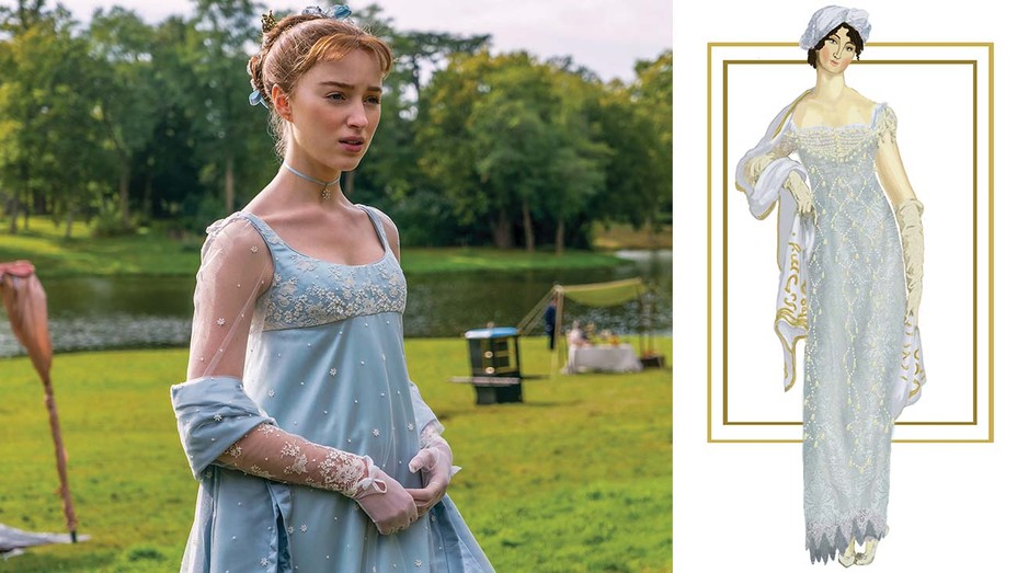
The wardrobe of Bridgerton’s does not replicate the identical preferences of 1813 Regency London dresses and trends. As per the dress designer, Ellen Mirojnick the colours and fabrics were used from time periods of the 1950s and 1960s. The Bridgerton’s have been plotted to wear muted colours in order to depict the status and the prestige of the family. The muted blues and silvers used to highlight the influential family of the series.
The bee referred to in the series which were plotted in Benedict Bridgerton’s commode depicts the relationship of the father, Edmund Bridgerton and the son.
On the other hand, Hastings was plotted wearing dark colours like red and gold to depict the royalty and the pained childhood experiences of the duke.
The duchess, Daphne was seen wearing purple which highlights the reality of marriage by collaborating the colours worn by Bridgertons’ and Hastings’.
Throughout the series, for the Featheringtons, they have used bold colours as green, yellow and purple to depict the desire for them to be seen and to illustrate that they were new to the social status: upper-class.
The merry, amiable and the wary personality of Penelope was highlighted through the use of yellow in which she was dressed mostly during the series.
Queen, Golda Rosheuvel wears an immense ‘fro in one of the balls in the series exhibiting her blended race and her past